


|
|
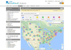
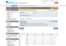
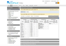
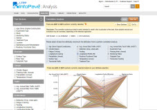
Correlation Analysis
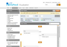
Correlation Analysis allows users to visualize the relationship among multiple data attributes based on the selected test sections. The feature provides pre-defined data attributes, and users can select up to five of these attributes for correlation analyses. Data for the selected attributes are drawn in the form of parallel coordinates plots where each attribute is displayed as a vertical axis on the plot. The range of each data attribute can be adjusted on each vertical axis to narrow down the correlation analysis.
Selected Section:State/Province:Section:Section Information:Disclaimer: The correlation analysis provided is solely intended to assist in the visualization of the data. More detailed analysis and evaluation may be warranted, depending on the intended application.
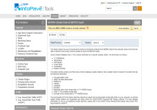
Currently no data is selected to perform correlation analysis. |
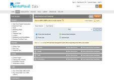
 Data Selection and Download
 Explore Geospatial Analysis
 Section Summary Report
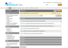
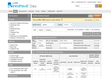 Table Export
 Section Timeline
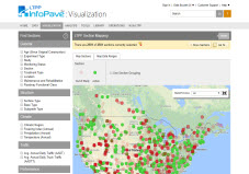
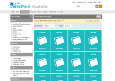
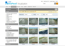
 Distress Maps and Images
 View Inspection Videos
 Data Pivot
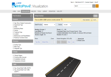
 Pavement Cross-Section Viewer
 Manual Distress Survey Viewer
 Ancillary Data Selection
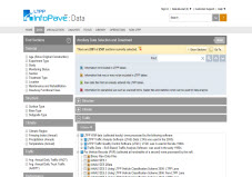 Axle-Load Distribution Factors
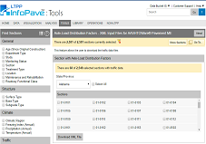 Transverse Profile Viewer
 State Summary Report
 MERRA Data for MEPDG Inputs
 Analysis Ready Datasets
 Correlation Analysis
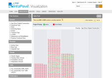
 Data Availability
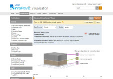
 Virtual Section